An Overview of Basic Pixel Shading
This isn't a tutorial per se. Rather, it's a quick demonstration as to how different shading can work.
If you're going to practice shading, you're going to need a few colors. If you'd rather not go through all the fuss of picking custom colors yourself, you can use this palette. To use it, copy and paste it into your art program and use the eyedropper tool to select what color you want.

If that's too small, then don't fret - either zoom in or enlarge the image if need be.

Looks shiny, huh? It was actually very simple to do. Take a look at it zoomed in...
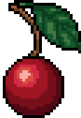
Note how the different shades of red, green, and brown are placed.
Now I'm going to crystallize that shiny red fruit...

Whoa! It's crystalline now! (Or it just has another light source, take your pick.) Let's take a look at it zoomed in!

Again, note where the colors are and how they correspond to the smaller image.
Now I'm going to put that cherry in a setting.

The best advice I can offer is to study artwork. Pay attention to how other people shade. If you have to, paste pixel art into your art program so you can zoom in and get a better bead on the details. (And feel free to use any of mine for your research!)
You might also be interested in:
Hazards & Liabilities In Hair, Costume, & Wardrobe